QuantumDigital Rebranding and Redesign
QuantumDigital Rebranding and Redesign
QuantumDigital Rebranding and Redesign
Client:
Client:
Client:
QuantumDigital
QuantumDigital
QuantumDigital
Project Duration:
Project Duration:
Project Duration:
6 Months
6 Months
6 Months
Role:
Role:
Role:
UX/UI Designer
UX/UI Designer
UX/UI Designer
Team:
Team:
Team:
Solo Designer with a Product Manager & an Engineer
Solo Designer with a Product Manager & an Engineer
Solo Designer with a Product Manager & an Engineer
Year:
Year:
Year:
2022 - 2023
2022 - 2023
2022 - 2023
Overview
QuantumDigital is a B2B/B2C marketing leader in the Real Estate industry with a strong focus on innovation and lead-producing products and wanted the website to reflect that. The existing website lacked visual appeal, brand identity, usability, and failed to effectively communicate the company's offerings. The goal was to create a modern and intuitive website that not only showcased their products but also established a strong brand presence.
QuantumDigital is a B2B/B2C marketing leader in the Real Estate industry with a strong focus on innovation and lead-producing products and wanted the website to reflect that. The existing website lacked visual appeal, brand identity, usability, and failed to effectively communicate the company's offerings. The goal was to create a modern and intuitive website that not only showcased their products but also established a strong brand presence.
QuantumDigital is a B2B/B2C marketing leader in the Real Estate industry with a strong focus on innovation and lead-producing products and wanted the website to reflect that. The existing website lacked visual appeal, brand identity, usability, and failed to effectively communicate the company's offerings. The goal was to create a modern and intuitive website that not only showcased their products but also established a strong brand presence.
Challenges
Outdated Design: The old website had a cluttered and outdated design that didn't resonate with the company's audience.
Outdated Design: The old website had a cluttered and outdated design that didn't resonate with the company's audience.
Outdated Design: The old website had a cluttered and outdated design that didn't resonate with the company's audience.
Information Architecture: The content structure was convoluted, making it hard for visitors to find relevant information quickly.
Information Architecture: The content structure was convoluted, making it hard for visitors to find relevant information quickly.
Information Architecture: The content structure was convoluted, making it hard for visitors to find relevant information quickly.
User Experience: Navigational issues were causing users to leave the site prematurely.
User Experience: Navigational issues were causing users to leave the site prematurely.
User Experience: Navigational issues were causing users to leave the site prematurely.
Brand Identity: There was not an established brand identity that could help define the company visually.
Brand Identity: There was not an established brand identity that could help define the company visually.
Brand Identity: There was not an established brand identity that could help define the company visually.


Approach: Defining the Brand & Developing a Visual Guide
We first had to define the brand. After talking to stakeholders and working with the Marketing team, we decided that our brand identity will be defined by an approachable, friendly, and neighborhood feel. This gives us the guidelines to create a visual design system where the illustrations and icons exemplify these principles so our products display a cohesiveness in our brand while making complex ideas more accessible.
We wanted the visual guide to specify styling and include examples of backgrounds, patterns, and components that contribute to creating that neighborhood feel and theme.

Approach: Information Architecture
The lack of usability was a result of an undefined goal and purpose of the website. We wanted to restructure the information architecture of the site with the newly defined key stakeholder’s goals and new user goals in mind.
The lack of usability was a result of an undefined goal and purpose of the website. We wanted to restructure the information architecture of the site with the newly defined key stakeholder’s goals and new user goals in mind.
The lack of usability was a result of an undefined goal and purpose of the website. We wanted to restructure the information architecture of the site with the newly defined key stakeholder’s goals and new user goals in mind.
Key Stakeholder's Goals
Explain services and products offered
Attract new users
Explain what the company does and stand for
Key Stakeholder's Goals
Explain services and products offered
Attract new users
Explain what the company does and stand for
Key Stakeholder's Goals
Explain services and products offered
Attract new users
Explain what the company does and stand for
User Goals
Find information easily
Complete tasks efficiently
User Goals
Find information easily
Complete tasks efficiently
User Goals
Find information easily
Complete tasks efficiently
Previously, secondary navigational items were hidden within the page and could not be easily accessed through the navigation bar. We wanted to create a logical navigation flow and structure and organize the content accordingly.
Previously, secondary navigational items were hidden within the page and could not be easily accessed through the navigation bar. We wanted to create a logical navigation flow and structure and organize the content accordingly.
Previously, secondary navigational items were hidden within the page and could not be easily accessed through the navigation bar. We wanted to create a logical navigation flow and structure and organize the content accordingly.

Navigational items hidden within the page
Navigational items hidden within the page
Navigational items hidden within the page
Through site mapping and establishing the user journey, we were able to determine how the web pages connect while prioritizing content so users can navigate the new site easily.
Through site mapping and establishing the user journey, we were able to determine how the web pages connect while prioritizing content so users can navigate the new site easily.
Through site mapping and establishing the user journey, we were able to determine how the web pages connect while prioritizing content so users can navigate the new site easily.


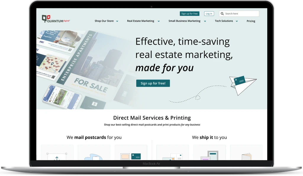
Approach: Redesigning the Website
With our newly established brand and visual identity and restructured information architecture, we redesigned each page and created a new cohesive website that reflected the brand, highlighted QuantumDigital's offerings, included clear call-to-actions, and was intuitive for the user.
With our newly established brand and visual identity and restructured information architecture, we redesigned each page and created a new cohesive website that reflected the brand, highlighted QuantumDigital's offerings, included clear call-to-actions, and was intuitive for the user.
With our newly established brand and visual identity and restructured information architecture, we redesigned each page and created a new cohesive website that reflected the brand, highlighted QuantumDigital's offerings, included clear call-to-actions, and was intuitive for the user.


Solutions
The rebranding and website redesign led to the following:
The rebranding and website redesign led to the following:
The rebranding and website redesign led to the following:
Enhanced User Experience: Streamlined navigation with intuitive menus increased overall user experience.
Enhanced User Experience: Streamlined navigation with intuitive menus increased overall user experience.
Enhanced User Experience: Streamlined navigation with intuitive menus increased overall user experience.
Modern UI: The revamped design showcased the company's products, aligning with the new brand identity.
Modern UI: The revamped design showcased the company's products, aligning with the new brand identity.
Modern UI: The revamped design showcased the company's products, aligning with the new brand identity.
Improved Engagement: Clear call-to-actions and organized content made it easier for users to engage with the company's offerings.
Improved Engagement: Clear call-to-actions and organized content made it easier for users to engage with the company's offerings.
Improved Engagement: Clear call-to-actions and organized content made it easier for users to engage with the company's offerings.
Increase Conversion Rates: The user-centric design led to improved conversion rates, with visitors spending more time on the site and exploring its content.
Increase Conversion Rates: The user-centric design led to improved conversion rates, with visitors spending more time on the site and exploring its content.
Increase Conversion Rates: The user-centric design led to improved conversion rates, with visitors spending more time on the site and exploring its content.
Results + Feedback
The redesigned website received overwhelmingly positive feedback from both the stakeholders and its users. Also, engagement rate increased by 18% and product activation increased by 4%.
The redesigned website received overwhelmingly positive feedback from both the stakeholders and its users. Also, engagement rate increased by 18% and product activation increased by 4%.
The redesigned website received overwhelmingly positive feedback from both the stakeholders and its users. Also, engagement rate increased by 18% and product activation increased by 4%.